This chart at Stat News tells the story of July 4th injuries so much better than was possible with the tools we had even a few years ago. The subject, fireworks, are used to represent each data point, plus the chart is interactive. Hovering over a data point gives specifics about one of the injuries underlying the data. The full article is worth a look for the other visualizations, as are other visualizations by Natalia Bronshtein @ininteraction.
Category: data stories
Measurement as a source of innovation
 Makers of men’s shirts have finally figured out a model for providing custom orders tailored to individual dimensions. Prompted by the ads prevalent across social media and professional blog spaces, I recently ordered custom shirts from two different providers. One maker promised a great fit based on a predictive algorithm; the other provided a how-to guide for measuring my own exact dimensions. The shirt based on measurement is now the best fitting shirt in my closet, while the shirt based on prediction actually fits worse than many department store brands.
Predictive analytics is as much as ever the exciting frontier in our field. Yet we too often undervalue the importance of better measurement as a source of innovation. My now favorite clothier figured out how to achieve sufficiently precise self-service tailoring in the convenience of home. In fitness and health, sensors can track actual behavior that only a few years ago required expensive laboratory studies. Across many voice and text applications, the occurrence of specific words and overall sentiment have migrated from the qualitative to the quantitative. Today, innovation in business intelligence is as much about making measurement more precise and user friendly as it is about finding the right reporting engine and defining KPIs. The power of predictive analytics will certainly continue to expand. I expect the predicted shirt will someday be my favorite fit, though how it fits and how it looks will still be the ultimate measure.
Why the data needs a story
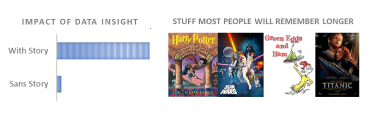
People in quantitative and scientific fields too often undervalue the importance of soft skills, including storytelling. Now the longstanding message from communications experts is increasingly backed by quantifiable findings. Speaker Carmine Gallo writes: “Thanks to advances in neuroscience, brain scans, and data-driven studies, we’ve learned more about persuasion in the past decade than we had ever known previously.” Neuroscientists can map our brain activity during stories. Data scientists have analyzed the content of TED talks and other speeches to conclude that “messages including apt, well-crafted stories are 35% more persuasive.” In The Leading Brain, the authors cite research showing “that people are more receptive to ideas when their minds are in story mode as opposed to when they are in a more analytical mind-set.”
For all of us quants, it would be ironic if it took the growing body of hard evidence to finally convince us of the importance of using stories to make our points.
